Veligandu Maldives Logo – The story
Veligandu’s logo and the brand name, which evolved with the resort’s growth since 1984, symbolize the island’s service excellence.
The resort rebranded from Veligandu Island Resort & Spa to Veligandu Maldives Resort Island in March 2024, and a captivating new logo reflecting the island’s beauty was unveiled for the November 2024 re-opening after 18 months of renovation. This refreshed identity reflects our dedication to providing unparalleled experiences while staying true to our core values of hospitality and service excellence.
The evolution of the logo
Veligandu’s inaugural logo made its debuted in 1984, showcasing a meticulously hand-drawn representation of the islands’ sandbank. It symbolises the very essence of the island; the logo encapsulates the uniqueness of Veligandu, where “Veligandu” translates to sandbank in Divehi, the local Maldivian language.
A touch of sophistication was added to Veligandu ‘s visual identity in 2018 with a chic logo design. This refined logo not only signifies the distinctive southward sandbank and the island but also represents the abundant coconut palm trees of the island’s flora.
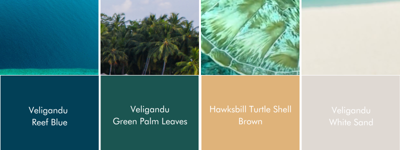
The new captivating colour palette is inspired by the Indian Ocean and marine life, the island’s greenery, and the sandbank. The logo is set in a deep blue that echoes Veligandu’s blue reef and the geological setting of the resort island emerging from the ocean while, the logo’s whiteness is reminiscent of the soft white sand of the sandbank
Planning your stay at Veligandu? Browse through our special offers
